Expert Excel Help - quick and simple charts and graphs
Microsoft Excel has many options when it comes to representing your data in graph and chart form. This blog will guide your through some of the basic steps you need to take when converting your data in to visual graphs and charts.
The process for creating, for example, a Column chart, is simple, just select the data you wish to represent and go to the Insert toolbar to find the appropriate chart. However, a few caveats must be accepted.
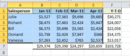
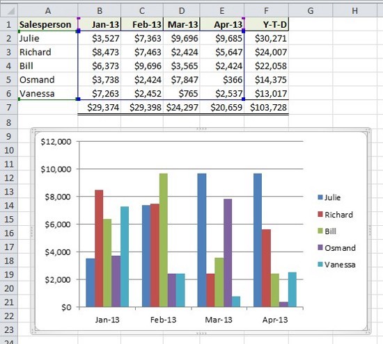
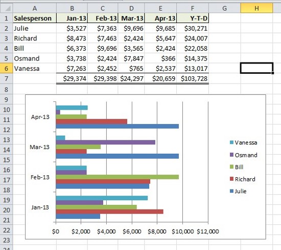
For example, when selecting your data, make sure that it will make sense in graph or chart form. As we can see, the selection of data here concerns only two variables, that is, a salesperson's results and the corresponding months in which those results were achieved.
If we were to add Year-To-Date totals for each salesperson, monthly totals or other details, it would become difficult to represent all the data.
Once we have carefully selected our data, we can move to the Insert toolbar. As you can see, there are many options here.
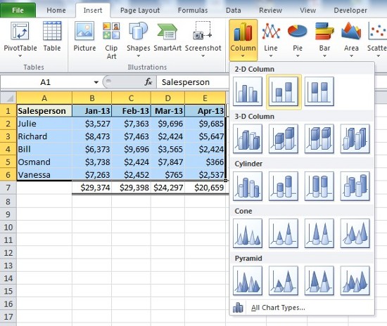
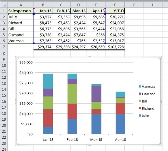
Some charts work better than others depending on the type of data being used. For example, a stacked column would, perhaps, not translate the data as well as a simple, generic column.
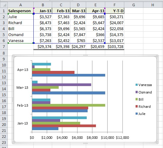
On the other hand, a horizontal bar chart may prove more engaging.
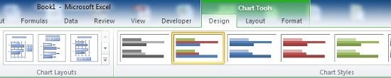
Notice how, once we have selected the type of chart we wish to use, the chart itself remains 'open' for editing, as can be see from both the highlighted cells in our data set and the graph itself with its grey border. When selected in this way, we can manipulate the image, moving it across the spreadsheet, changing colours (see Design options in the special Chart Tools toolbar) and resizing.
Click off the image - or in any free cell - to fix the chart, then Save in the normal way. To return to editing the chart, simply go back and click anywhere on the image.
For more help with creating simple and complex graph and chart representations, contact our experts.