Expert Excel Help – Adding a Trendline to Graphs
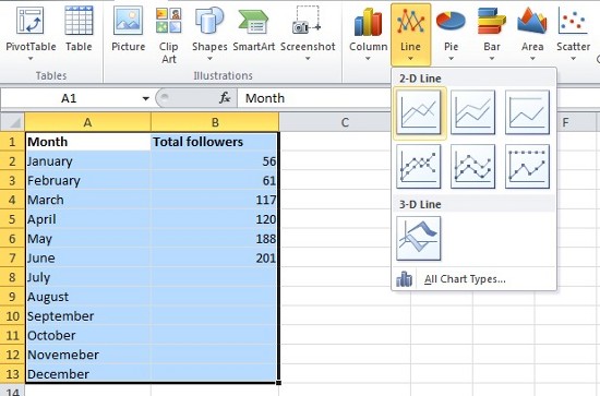
Today's Excel4Business tip reveals how to add a Trendline to graphs. The data-set below keeps track of Twitter followers and is recorded each month. Followers increase at an irregular pace and we wish to know, more or less, how many followers we will have by the end of the year.
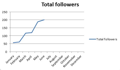
Step 1 is to select the data and create a line graph. This is a simple procedure and here we have selected the basic Line option from the Charts panel. Excel then generates our graph:
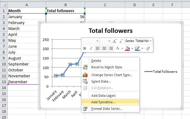
Once the graph has been created, we need to carefully right click exactly on the recorded line itself. This brings up and number of options from which we choose Add Trendline.
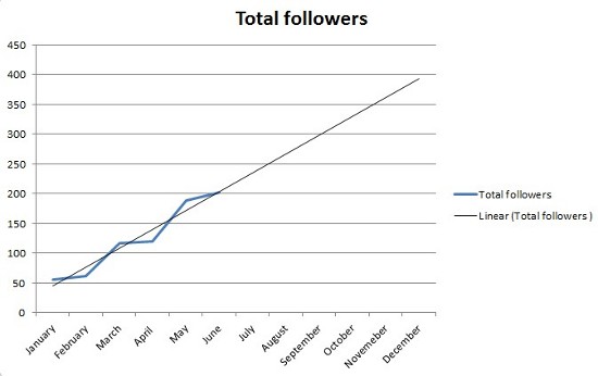
The Format Trendline options box is automatically brought up where there are various options for presentation. We accept the default options and click Close. Finally, we are presented with our trendline showing that we are projected to reach just short 400 followers by the end of the year:
For more details on using trendlines in Microsoft Excel check the help pages here or contact the Excel4Business experts.