Excel Help - How to Create a Line Graph in Excel 2013
This video will show you how to make line graphs in Excel. You’ll find this useful when you want to track progress and visualize your data to make it more comprehensible.
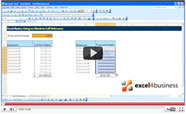
In this case we’ll analyze website traffic by checking the number of views and the inquiries sent over one week.
Begin by entering the data you would like to see in the graph. List the data categories at the top of your table and enter the values in the columns below. Now select the data you want to use in the graph. Note that the chart will have as many lines as you have columns.
Right-click and press insert.
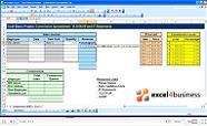
Choose the Recommended Charts button to see the program’s suggestions for visualizing your data. Alternatively, go to Chart to see all available types of chart. Select Line.
A line graph with your data will now appear on the spreadsheet.
You can use the Design tab to change the appearance of the chart. You can also use the legend that appears on the side here to edit your chart. The first button lets you add new chart elements, the second button is for modifying the style of the chart, and the third button lets you filter data in the chart. You can also manually drag and drop the corners of the chart to change its appearance.